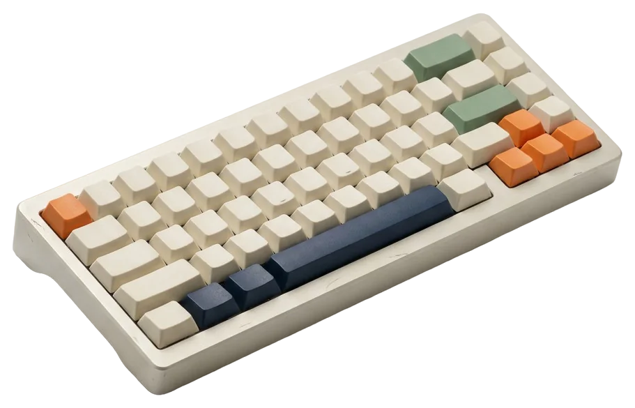
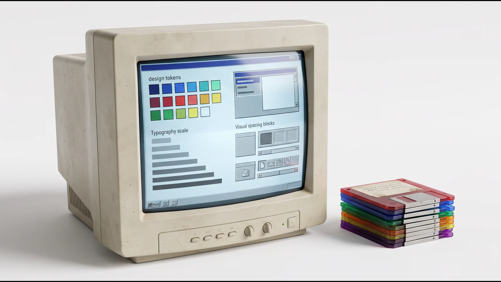
A design system is a set of reusable design decisions: tokens (colors, typography, spacing), components with their variants and states, usage rules and documentation, shared between designers and developers. It helps teams ship faster, more consistently and more accessibly.
What I build
I size the system to the team that will keep it alive. A system too ambitious for a team of four ends up abandoned. A system too light for a team of forty fragments.
Foundations
- Tokens: semantic colors (background, surface, text, accent, status), fluid type scale, spacing scale, radii, shadows, animation durations.
- Themes: light and dark, plus white label when the product is resold to clients who want their own identity.
- Grid and layout: containers, columns, breakpoints, density rules.
Components
A dozen components cover 80% of a SaaS product's screens: button, field, select, checkbox, switch, table, card, navigation, tabs, modal, notification, badge. Each ships with its variants, its states (default, hover, focus, active, disabled, error, loading) and its accessibility rules.
Documentation and governance
- One page per component: when to use it, when not to, examples, counter-examples.
- A contribution process: who proposes, who approves, how an exception becomes a component.
- A changelog the whole team can read.
Figma and code, one language
Most systems break at the gap between the Figma file and the code. I close it at the source:
| In Figma | In code | Why |
|---|---|---|
Color variables color/surface/raised |
CSS property --color-surface-raised |
Same name, no mental translation |
Button component with a tone property |
<Button tone="primary"> component |
Variants map to props |
Text styles text/body/md |
Class or token text-body-md |
One single type scale |
| Light / dark mode | data-theme attribute |
The theme is data, not duplication |
When the team wants it, I write the Code Connect files or the token layer (JSON, CSS) so the link is tooled rather than just documented.
Real cases
- Climeet: a full Figma design system for a carbon footprint app, with tokens, components, variants and a library reused on the marketing site. The system made it possible to rebuild the calculator as a simplified version without redrawing the foundations.
- Reformer Society: a dark system with white label per studio, an accent color overridden by each client, the same components across three areas (public, studio, super admin).
- WeeFizz: design system for the PRO SaaS and the e-commerce widget, with an i18n system in eleven namespaces and components shared across four CMS integrations.
Mistakes I avoid
- Starting with components instead of tokens: everything has to be redone at the first rebrand.
- Copying a big player's system: it solves their problems, not yours.
- Documenting before using: documentation is written from real screens.
- Trying to cover every case: a system covers the frequent cases and allows tracked exceptions.
The full method for getting started is in Design system: where to start.
Engagement formats
- Audit of what exists (one to two weeks): inventory of real components, Figma/code gaps, consolidation plan.
- Foundations (three to six weeks): tokens, core components, initial documentation, handover.
- Ongoing support (a few days a month): contribution reviews, trade-offs, system evolution.