The problem
Event organizers have to measure and reduce their carbon footprint, under pressure from clients and regulation. Existing tools are built by experts, for experts: dozens of required fields, technical jargon, a constant sense of being audited.
Climeet wanted a tool any organizer could fill in, one that delivers a credible result from imperfect data and encourages progress instead of guilt.
My role
Art direction, design system in Figma, React prototypes of the key screens, then the marketing website. I worked with the founder, a UX designer in charge of wireframes, and a development team.
Key design decisions
Simplify the calculator
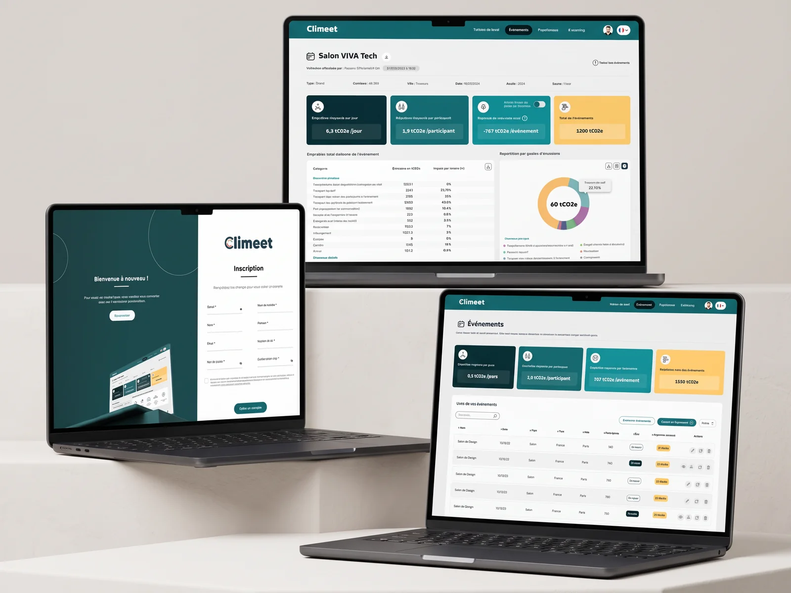
Client feedback on the first version was clear: too complex. We rebuilt the calculator around five data quality levels, from rough estimate to precise figure, with one absolute rule: never blocking. Organizers move forward with what they know, the tool shows how reliable the result is, and they can refine later.
Three views per category
Every emission category (transport, catering, accommodation, equipment, digital) reads through three views: total, breakdown and comparison. Same structure everywhere, so learning the first category teaches you all the others.
Gamification that doesn't cheat
Levels, badges and medals in the logo colors reward completeness and progress, not virtue signaling. A welcome popup explains the system, white blocks carry the learning content. The goal: make people want to come back and complete their data.
A design system that paid off twice
The Figma system (tokens, components, variants) was built for the app. When the simplified version was decided, the foundations stayed put: only the screens changed. The same system then fed the marketing website.
The marketing website
Seventeen statically generated pages, a full-screen hero, app screenshots staged in device frames, eighty-two client and partner logos, and photos chosen to never look like staged stock imagery. A wide container, assertive typography, and copy that explains without jargon.
Real-world constraints
- Brand fonts missing from team workstations: a controlled, documented substitution.
- A client changing direction after seeing the first version: that is exactly what a first version is for.
- An app and a website that had to speak the same visual language, built by different teams.
Takeaways
- "Never blocking" is a stronger design principle than any component.
- A well-founded design system absorbs a change of direction without a redesign.
- Gamification works when it rewards real effort.
See climeet.events. Expertise involved: design system, art direction, UX strategy, web design.