Skip to content
FREN Book a call
( Widget · E-commerce · Fit tech )( 05 / 08 )

WeeFizz Fashion, the widget

One size in the box, the right one. The widget that answers "M or L?" right on the product page, designed and built to install in minutes in any online store.

· 2 min read · Widget · E-commerce · Fit tech

WeeFizz Fashion size recommendation widget, landing page and widget on mobile
WeeFizz · Widget · E-commerce · Fit techweefizz.com/widgets/fashion

( Key facts )

WeeFizz Fashion is the WeeFizz size recommendation widget for the product page, with virtual try-on on a photo. Vladimir Spalaikovitch designed and built it to install in minutes on Shopify, WooCommerce, PrestaShop and Magento.

Role
Product design, art direction, front-end development
Timeline
2024 to present
Industry
Apparel, e-commerce
Scope
Widget, wearer flow, virtual try-on, landing page, onboarding
Stack
JavaScript, Shopify, WooCommerce, PrestaShop, Magento

The problem

When shoppers don't know their size, they order two sizes "to try" and send one back. For the store, that means a return to process, a garment to repackage and a shrinking margin. For the shopper, it means hesitation that often ends in an abandoned cart.

The WeeFizz Fashion widget opens from the product page, asks a few questions and recommends a size, calculated against the store's own size chart, before the item goes into the cart.

My role

End-to-end design of the widget, art direction of the offer's landing page and front-end development of the integration on four CMS platforms. The same component has to live inside hundreds of different themes without ever breaking the product page.

Key design decisions

A flow that takes less than a minute

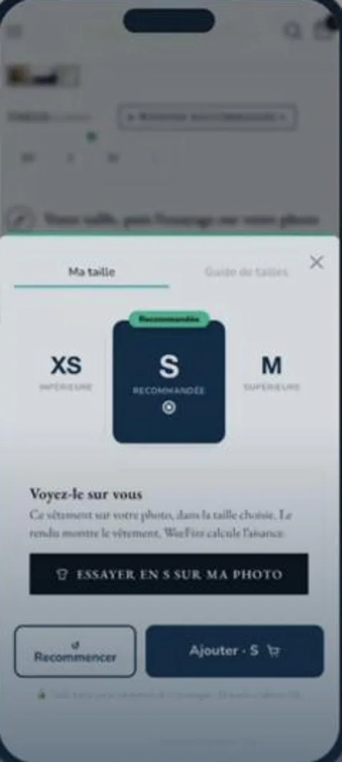
The wearer questionnaire comes down to three body shape axes plus height, weight and age. No tape measure, no account to create. The recommendation shows up alongside the sizes just below and above, so the shopper understands the choice and can push back on it.

See the garment on yourself

The "Try size S on my photo" button launches the virtual try-on: the shopper takes a photo and the render shows the garment in the recommended size. The processing is spelled out on screen, and the photo is not kept. The try-on removes the last doubt before adding to cart.

Disappear into the store

The widget inherits the theme's fonts and colors, respects touch targets, adds no heavy dependencies and loads after the product page. Automated visual QA checks 165 cases against real size charts before every release.

An offer you get in ten seconds

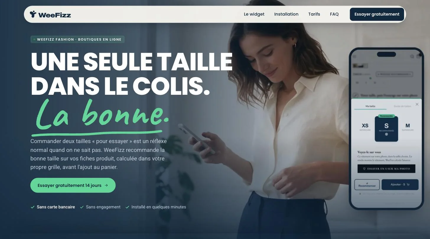
The landing page states the promise in one sentence, shows the widget in context on mobile, then walks through installation, pricing and FAQs. A free 14-day trial, no credit card, no commitment: the three main objections are handled right under the button.

Takeaways

  • The best widget is the one the store doesn't notice and the shopper actually uses.
  • Explaining a recommendation beats imposing it.
  • Automated QA is the only way to ship fast on four CMS platforms without regressions.

See weefizz.com/widgets/fashion. Expertise involved: B2B SaaS UX/UI, front-end, web design.
( Gallery · 03 )

The project in screens

WeeFizz Fashion, the widget · Landing page: one size in the box, the right one
01Landing page: one size in the box, the right one
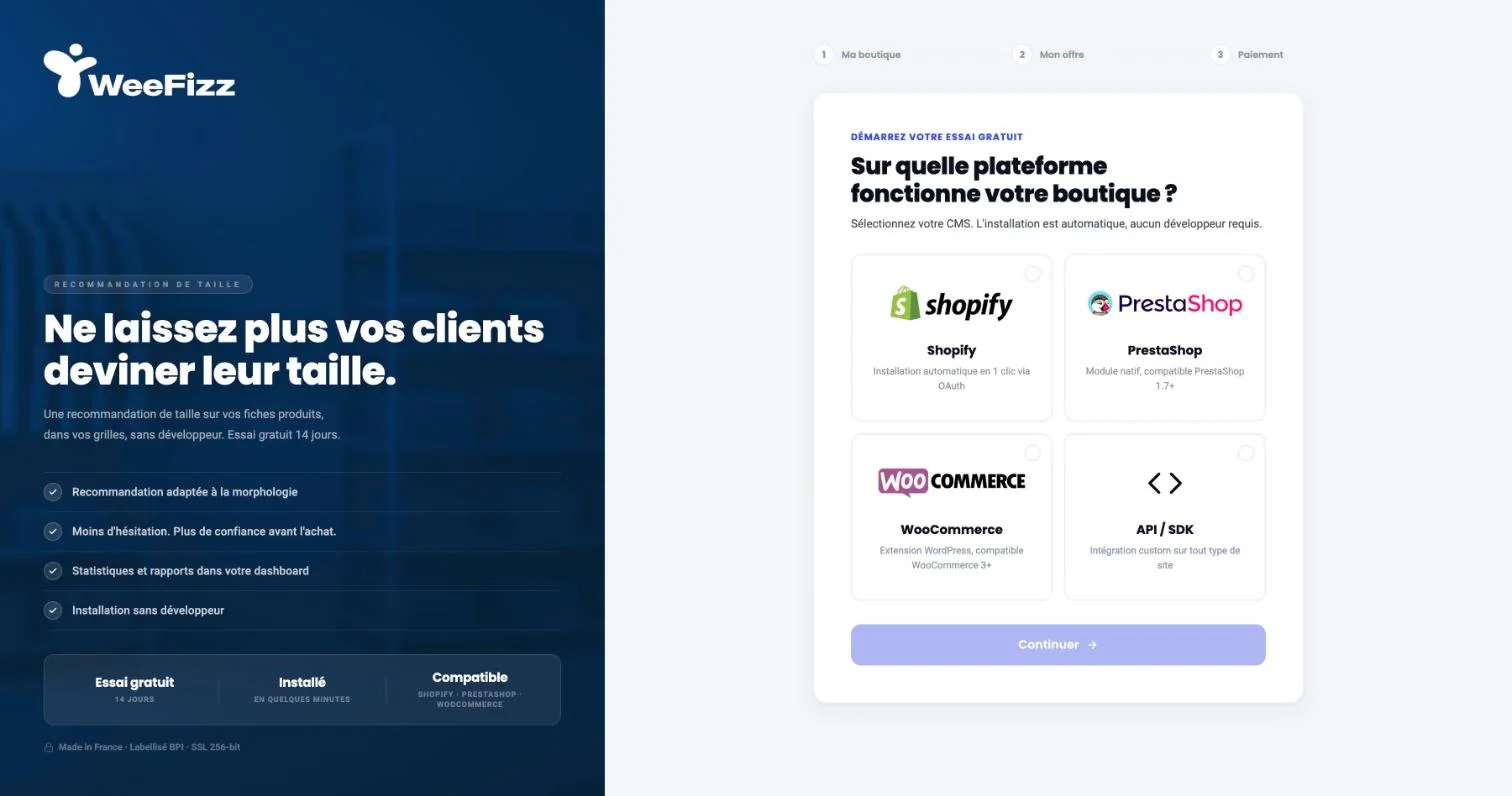
WeeFizz Fashion, the widget · Onboarding: choose your platform, install without a developer
02Onboarding: choose your platform, install without a developer
WeeFizz Fashion, the widget · The widget on mobile: XS, S recommended, M
03The widget on mobile: XS, S recommended, M
( Next · 05 )

Keep reading

  1. WeeFizz

    WeeFizz case study: designing a size recommendation SaaS for fashion. E-commerce widget on four CMS platforms, dashboard, back office. Co-founder and CPO.SaaS · Fit tech · AIRead
  2. HOOD TEAM

    HOOD TEAM case study: identity and bilingual website for a venture studio that partners with founders for equity. Next.js, GSAP, marble and lime art.Identity and website for a venture studio that partners with founders for equity.Venture studio · Website · IdentityRead
  3. UX/UI for B2B SaaS

    B2B SaaS UX/UI designer: onboarding, dashboards, data, back offices, pricing, white label. Cofounder and CPO of a SaaS, 20 years designing business tools.SaaS UX/UIRead
  4. Front-end development: a designer who codes

    UX/UI designer who codes: realistic prototypes, pixel-perfect HTML, CSS and React front-end development, fast static websites and hands-on developer support.UX/UI designer who codes: realistic prototypes and HTML, CSS and React builds.Design · DevRead
  5. B2B SaaS UX: ten principles I learned building my own

    Ten B2B SaaS UX principles learned by co-founding a SaaS company: first value, one action per screen, real data, useful errors, clear pricing, measurement.Ten B2B SaaS UX principles, learned by co-founding a SaaS company. · 3 minRead