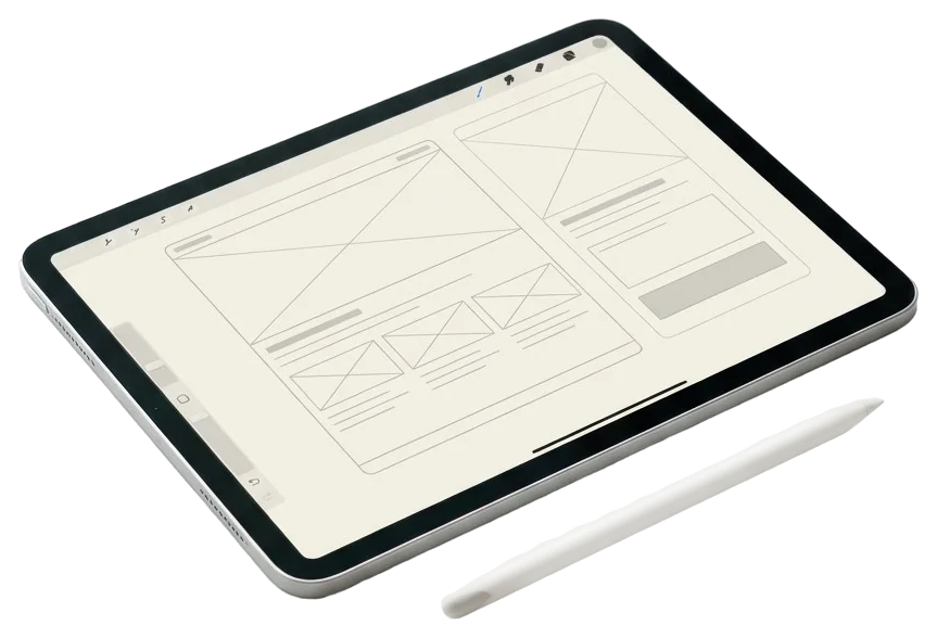

Product design covers the full design of a digital product: vision, user flows, interface, components and handoff to developers. UI design is the visible part: grid, typography, color, components and their states. I do both, with the eye of an art director.
What an engagement covers
A successful interface is one you do not notice. Getting there is very concrete work.
- Visual foundations: grid, type scale, palette, radii, shadows, spacing. Tokens, not random values.
- Components: buttons, fields, tables, navigation, cards, modals, notifications, with all their variants and states.
- Screens and flows: every journey broken down into real screens, realistic data, edge cases included.
- Micro-interactions: transitions, visual feedback, loading, confirmations. Restrained, never decorative.
- Prototype: navigable, testable, shareable with stakeholders.
- Handoff: specs, exported tokens, components named as in the code, visual QA after the build.
Premium interfaces: what that means
"Premium" is an overused word. To me it means four measurable things:
- Hierarchy readable in under three seconds: you know where to look and what to do.
- One primary action per screen, everything else is visually secondary.
- Total consistency: the same component behaves the same way everywhere.
- Finish quality: alignment, vertical rhythm, AA contrast, tuned typography.
These four criteria also serve as an evaluation grid during a UX/UI audit.
Products I have designed
| Product | Type | What I designed |
|---|---|---|
| WeeFizz | Fit-tech SaaS, AI size recommendation | E-commerce widget, client dashboard, uniform allocation mini-site, internal back office |
| Reformer Society | Streaming platform for pilates studios | Public area, studio area, super admin, video player, tablet kiosk |
| Climeet | Carbon footprint app for events | Art direction, Figma design system, simplified calculator, gamification |
| Portage à 1 euro | Website and member area for an umbrella employment company | Signup flow, offer pages, developer support |
Typography and art direction
An interface is first a typographic object. I tune the scale, weights, line height and contrast with the same care as an editorial layout. That comes straight from my digital art direction practice: products with an identity, not just usability.
Mobile, desktop, tablet
I design mobile-first when usage is mobile, desktop-first when it is a business tool. Either way, every screen is designed for its breakpoints, with touch targets of at least 44 pixels, no horizontal scrolling and components that reflow rather than shrink.
Accessibility
AA contrast minimum, visible focus, semantic structure, explicit labels, readable sizes, keyboard navigation. Accessibility is not an add-on at the end: it is built into the components from the foundations. It also helps SEO and reassures enterprises subject to RGAA, the French accessibility standard.
Starting a product design engagement
The most common formats: a two to four week design sprint for a feature or an MVP, or a three to six month ongoing engagement embedded in the product team. Let's talk about your product.