A UX/UI audit is a structured evaluation of a digital product: user flows, interface, accessibility, consistency and perceived performance. It produces a fact-based diagnosis, a list of problems ranked by severity and an action plan prioritized by impact and effort. It is the first step before any redesign.
What I audit
| Dimension | What I look at | Method |
|---|---|---|
| User flows | Steps, drop-offs, dead ends, cognitive load | Expert walkthroughs, usage data, interviews |
| Interface | Hierarchy, readability, states, consistency, density | Screen-by-screen heuristic review |
| Accessibility | Contrast, focus, structure, labels, keyboard | Automated tools + manual checks |
| Design system | Gaps between components, drift, duplicates | Inventory of real components |
| Content | Microcopy, error messages, vocabulary | Critical reading, comprehension test |
| Perceived performance | Load times, visual feedback, smoothness | Browser measurements, device testing |
| Conversion | Landing pages, pricing, signup, payment | Funnel analysis, benchmark |
The evaluation grid
I rely on the classic heuristics (visibility of system status, match with the real world, user control and freedom, consistency, error prevention, recognition rather than recall, flexibility, minimalist aesthetics, help with error recovery, documentation) plus four criteria of my own:
- Hierarchy readable in under three seconds.
- One primary action per screen.
- Every error state says what to do.
- The same component behaves the same way everywhere.
Each problem is rated by severity (blocking, major, minor, cosmetic) and each recommendation by estimated effort. Crossing the two gives the order of execution.
The deliverable
A document of about twenty pages, no more, structured to be used:
- One-page summary: the ten problems that matter, the plan in three phases.
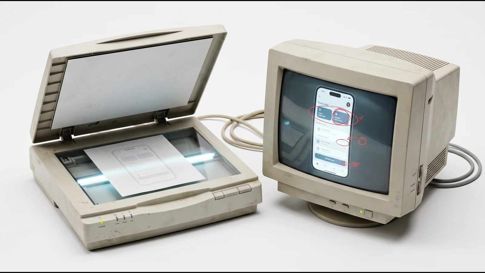
- Detail per problem: annotated screenshot, explanation, recommendation, severity, effort.
- Quick wins: what the team can fix within the week.
- Redesign plan: what requires design work, in order of priority.
- Appendices: full grid, test results, component inventory.
I present the results in a two-hour readout with the team, where we make the calls together.
With or without users
An expert review alone catches most interface problems. Usability tests, even with five participants, catch what the expert no longer sees: vocabulary, implicit expectations, detours. When the budget allows, I combine both. When it does not, I use existing data: support tickets, session recordings, analytics funnels, customer reviews.
Sample findings
A few findings from real audits, anonymized:
- A seven-step signup funnel where three steps only served the sales team: cut to four, the completion rate rose by more than a third.
- A dashboard with twelve metrics of the same size: nobody knew which one to look at. Three primary metrics, nine secondary, and the daily return rate went up.
- A design system with four different primary buttons depending on the team: one component, named variants, and screen delivery speed doubled.
After the audit
The natural next steps: a UX framing sprint if the audit reveals a deeper problem, a UI and product design redesign of the priority flows, or consolidating the design system.