The problem
Reformer pilates studios offer video programs to their members: sessions to follow at home, prep before a class, content for beginners. Generic streaming tools fit neither the studio context (a host screen in the room, tablets, guest members) nor its business model (one studio, one brand, one subscription).
Reformer Society is a platform built for them. Each studio gets its own branded space, members access the programs, and a super admin runs the whole thing.
My role
I designed and built everything on my own, from the first screen to deployment. That rare setup meant total consistency between intent and product, and iteration cycles measured in hours.
Three areas, one system
| Area | Users | Main features |
|---|---|---|
| Public | Members, guests, individual subscribers | Faceted search, HLS player, favorites, session prep page, getting started |
| Studio admin | Studio managers and coaches | Videos, programs, calendar, members, emails, kiosk, stats, brand customization |
| Super admin | Reformer Society | Studios, plans, subscriptions, access blocks, global stats, legal texts |
All three share a dark design system with an accent color overridden per studio: beige in dark mode, burgundy in light mode, or the studio's own color in white label.
Key design decisions
Full screen for the player, not the page
A "best experience" welcome screen requested full screen for the entire page. On tablets, it generated months of support tickets. The decision: drop page-level full screen and keep it for the video player only. The tickets went away.
The "I'm here for my session" kiosk
In the studio, the host screen has to let a member or a guest start a session without a password. A passwordless flow designed for a shared touchscreen, with automatic sign-out controlled from the studio admin.
Public search that follows the studio's own taxonomy
Every studio organizes its programs differently. Faceted search adapts to each studio's taxonomy instead of forcing generic categories: an accordion filter overlay, checkboxes per category type and a text field.
Self-service subscriptions
A Stripe checkout for individual subscribers, a configurable free trial, automatic reminders, webhooks, and access rights computed server side. Billing is a user journey like any other: it was designed, not just plugged in.
Details that matter
- HLS player with poster frame, resume playback and offline cache for tablets on weak connections.
- Daily viewing time cap for individual accounts.
- Transactional emails with blocks, templates and batch targeting.
- Light and dark modes, tablet responsive, mobile CSS pitfalls documented and tested.
- Editable legal texts, consent popups, domain kept out of search indexes during the private phase.
The public website: reformer-society.com
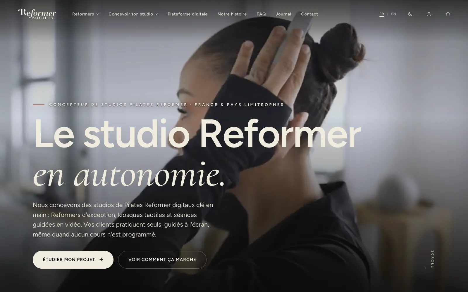
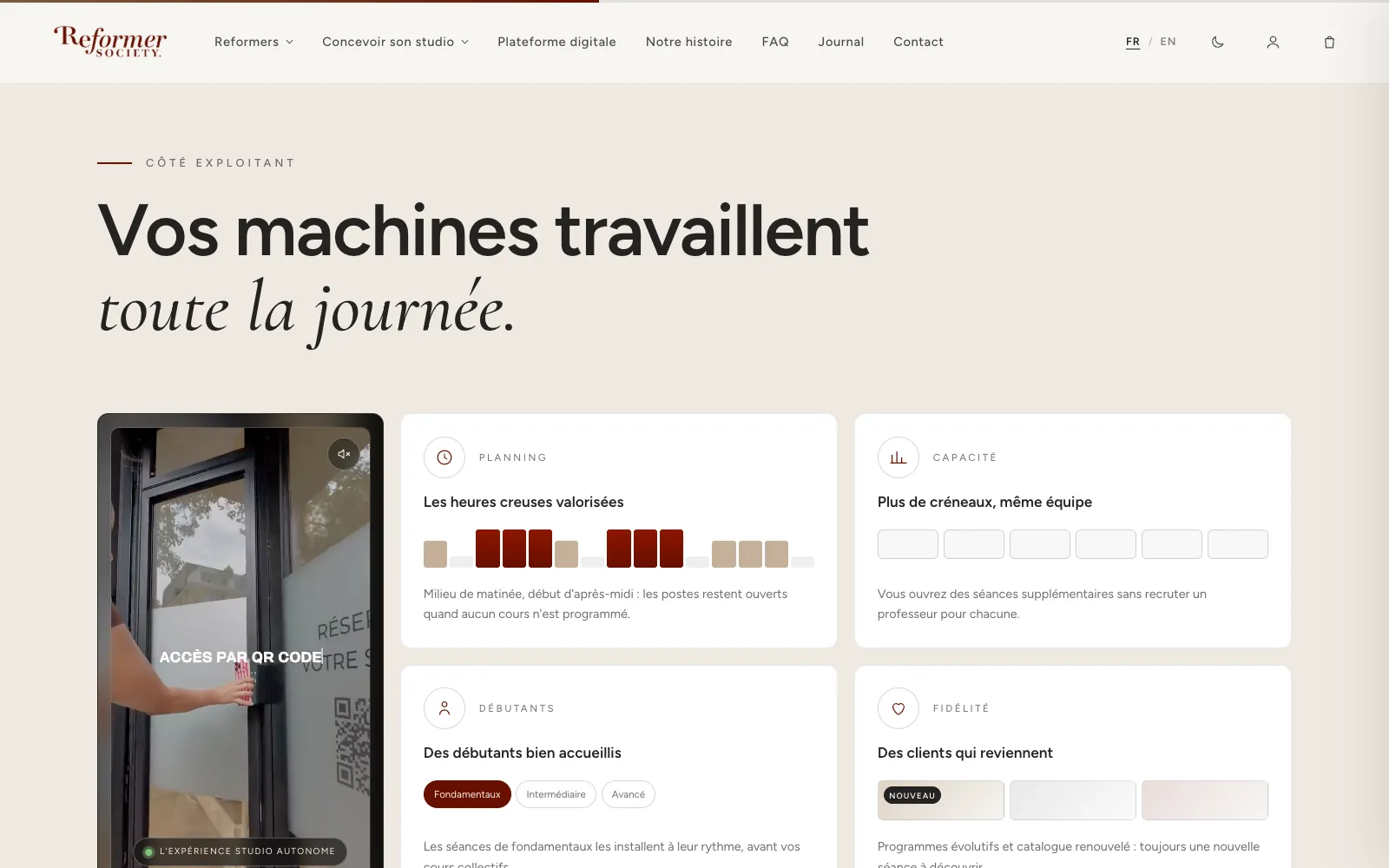
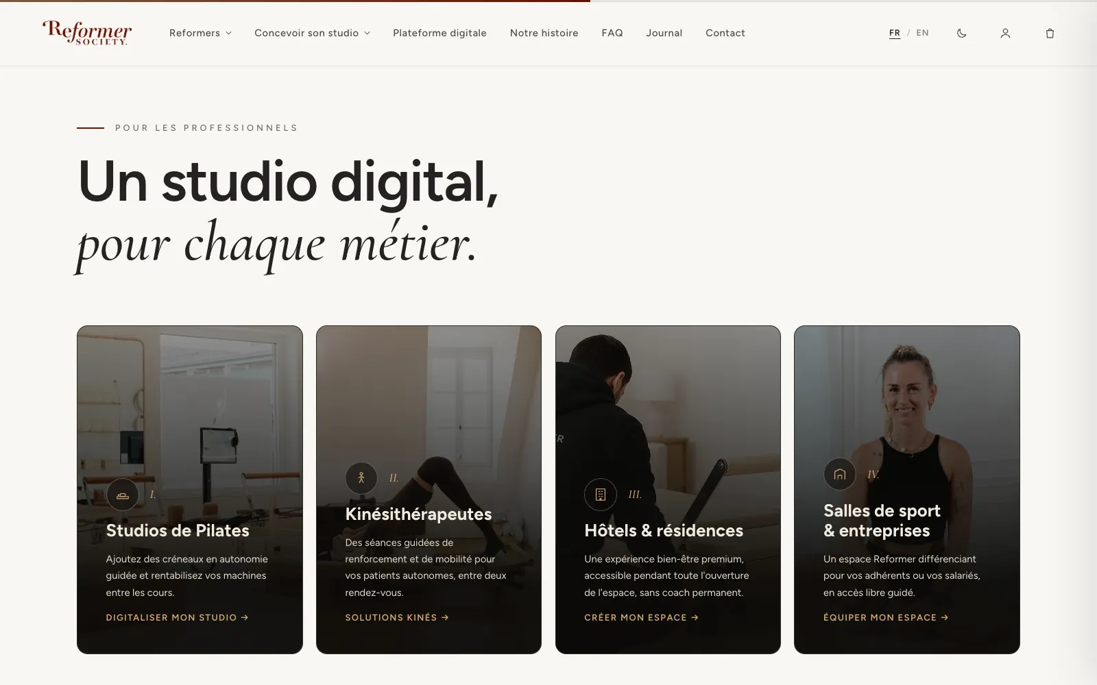
Alongside the platform, I designed and built the brand's public website, live at reformer-society.com. It speaks to professionals only (pilates studios, physiotherapists, hotels, gyms) with a sharp positioning: a turnkey Reformer pilates studio designer, "the digital studio that runs on its own".
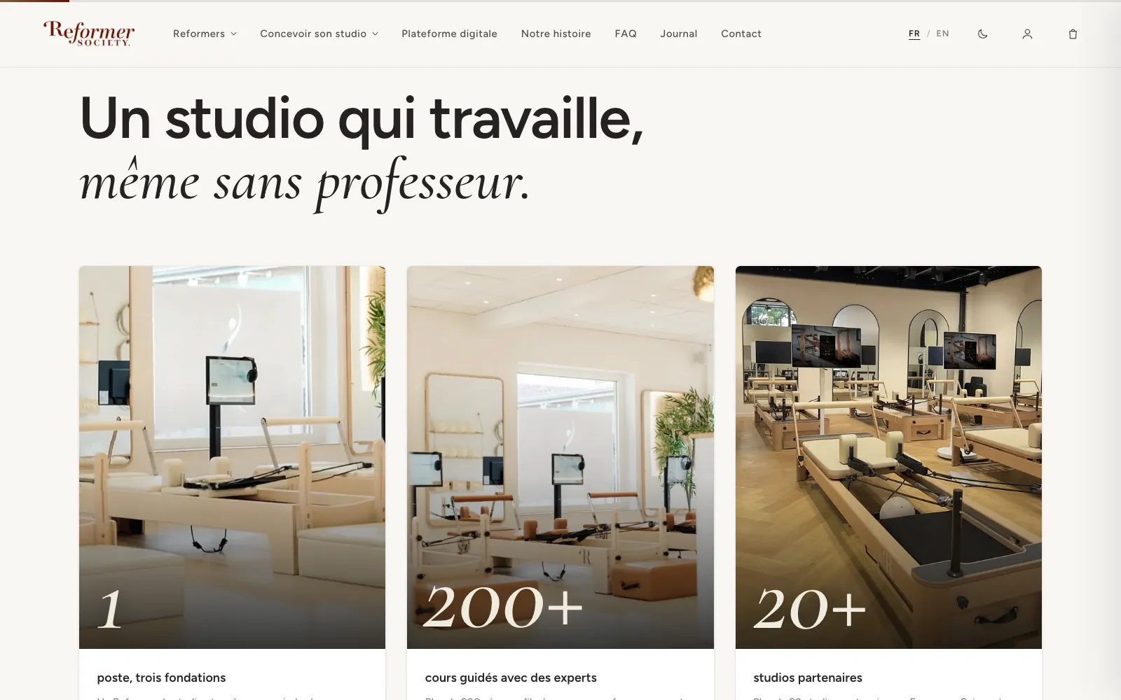
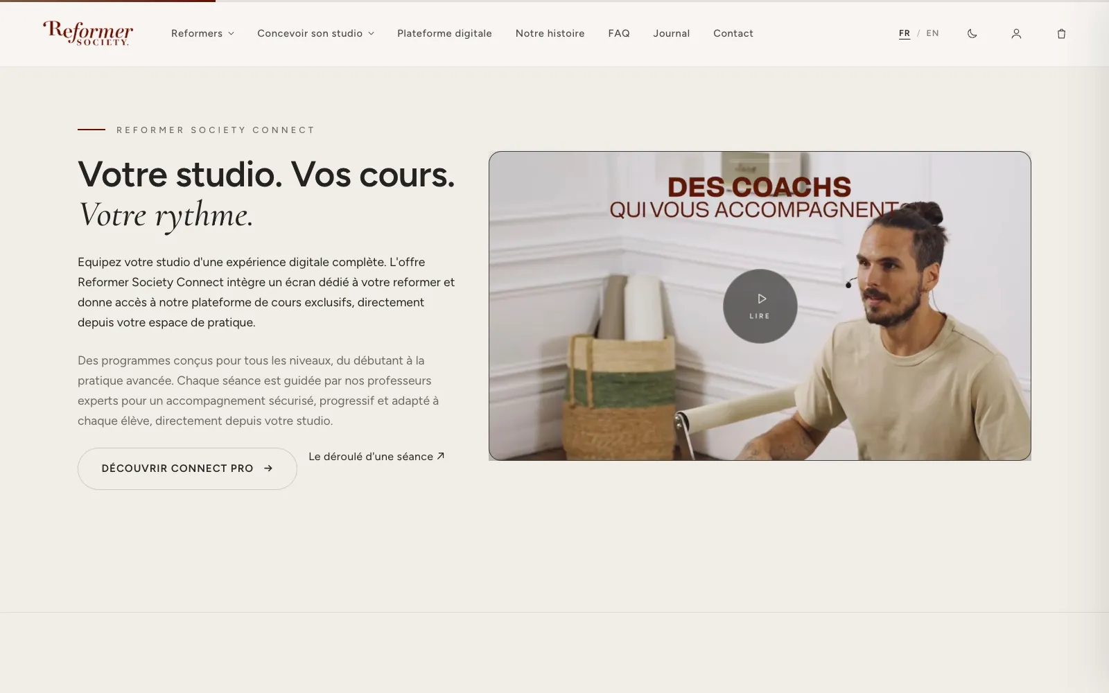
- A story in three foundations: the machines, a touch kiosk at every station, the library of guided sessions.
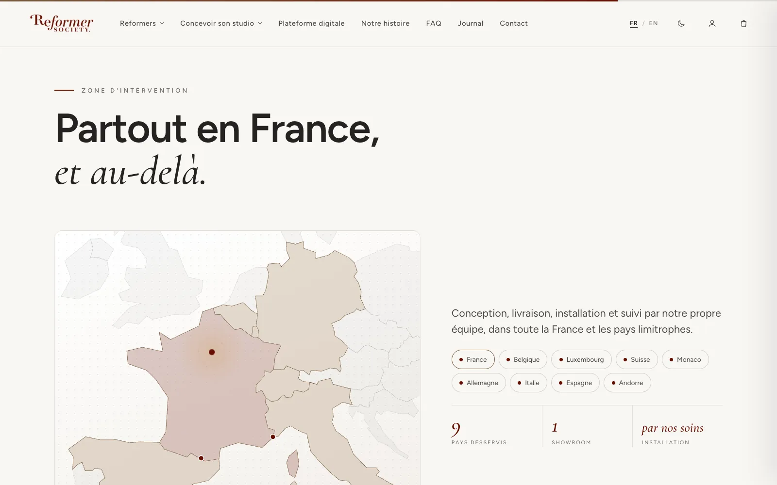
- Proof up front on the home page: 200+ guided classes, 8 instructors, 20+ partner studios in France and neighbouring countries.
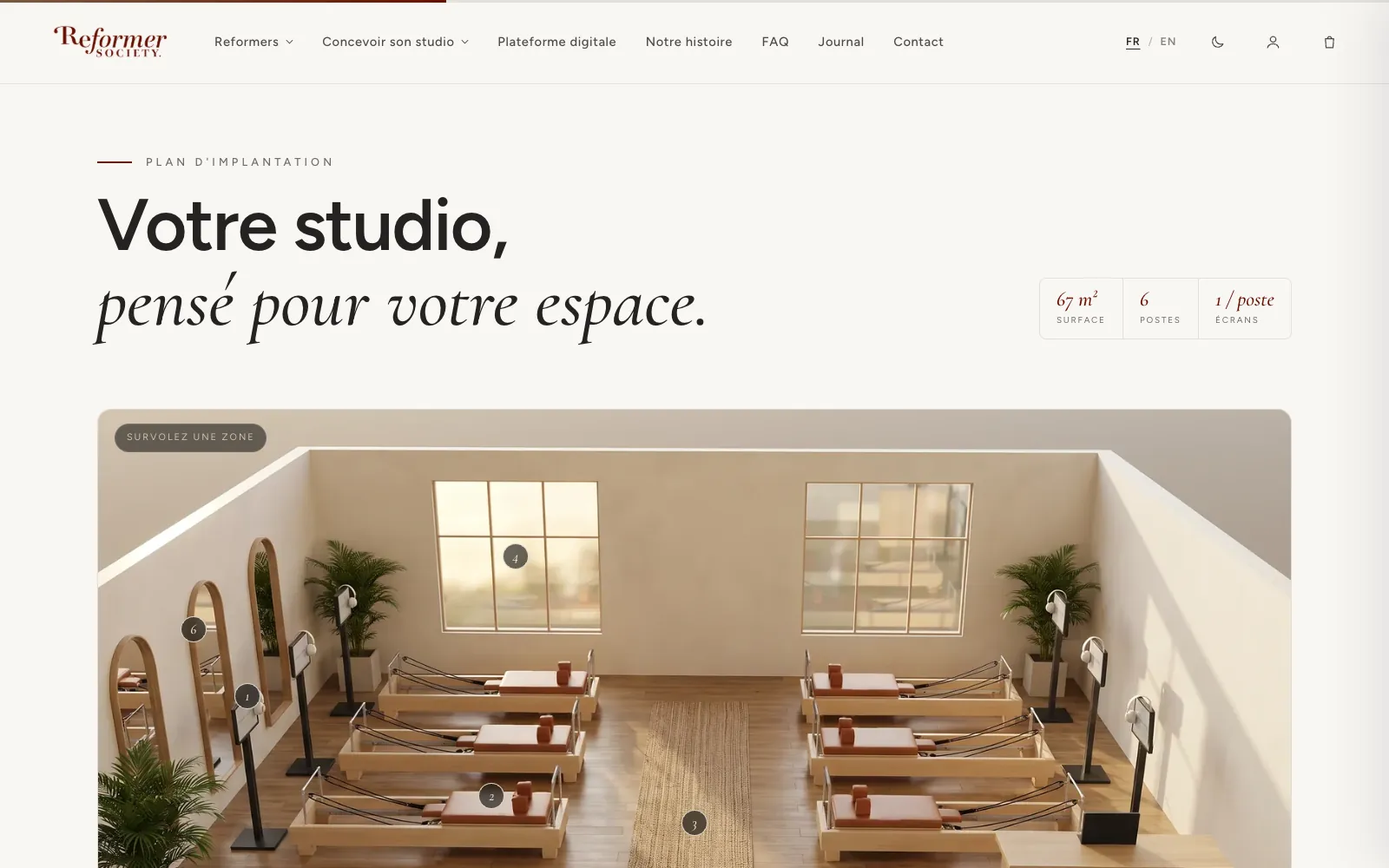
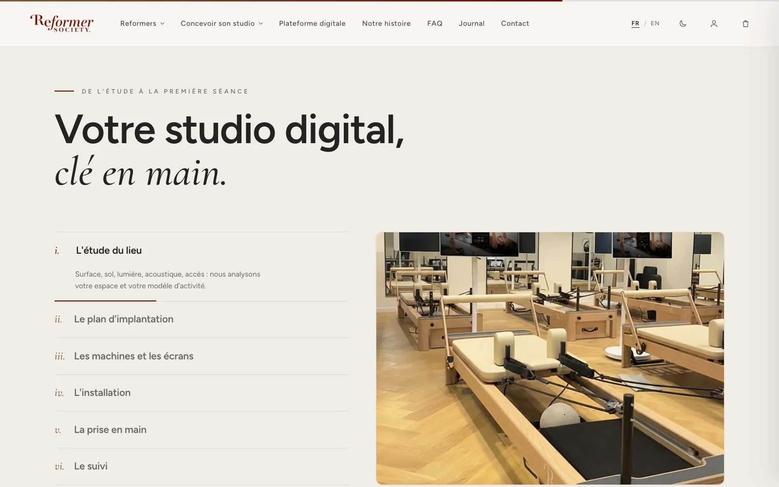
- An interactive floor plan to picture the studio in your own space, then a path "from site survey to first session".
- A custom CMS: every text, page, Journal article and SEO block is editable from a back office, with live preview.
- Bilingual FR and EN, clean URLs, light mode, page transitions, and a Journal of articles for search.
Takeaways
- When the same person designs and builds, the details survive.
- A multi-tenant product needs white label built into the tokens, not layered on top.
- Removing a feature is often the best bug fix.
- The subscription flow and the emails are screens in their own right.
See reformer-society.com. Expertise involved: front-end and integration, design system, B2B SaaS UX/UI, art direction.