The problem
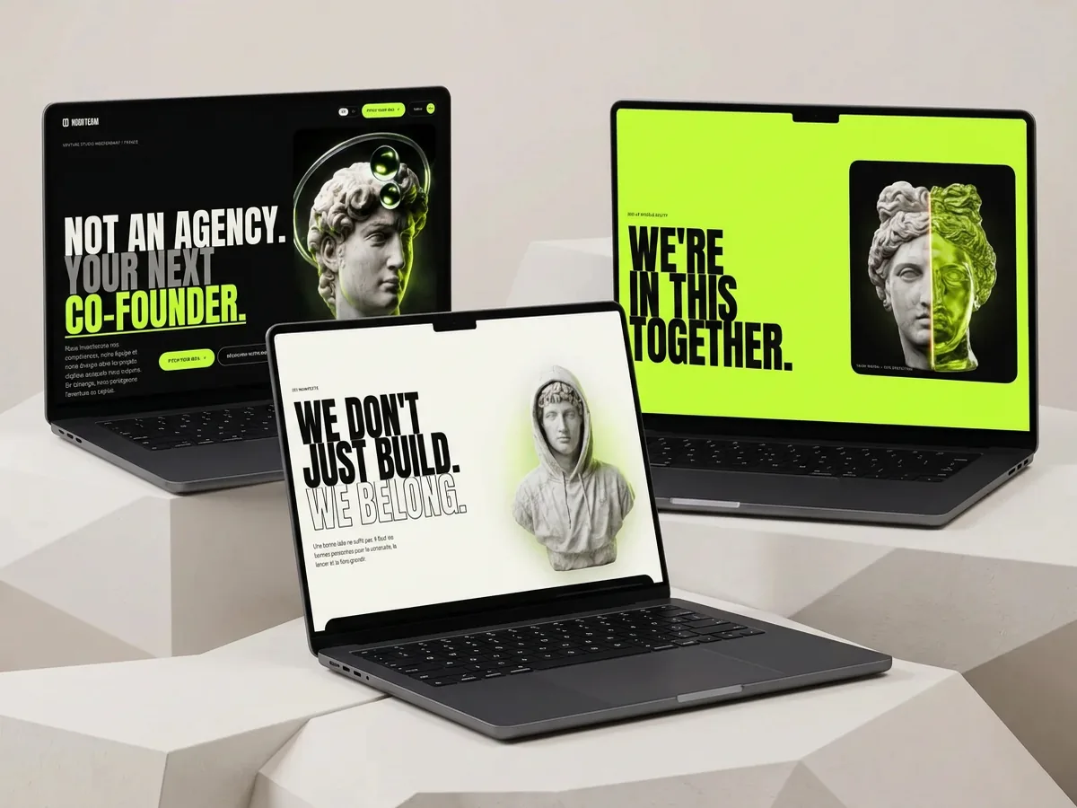
A venture studio sells a promise that is hard to believe: hands-on partners who commit to the project instead of an agency billing days. The website had to make it clear within seconds that HOOD TEAM is not a vendor, and make founders want to pitch their idea.
My role
As a co-founder of the studio, I owned the identity, art direction, design and development of the website, in French and English, through to launch at hood-team.com.
Key design decisions
One line that cuts through
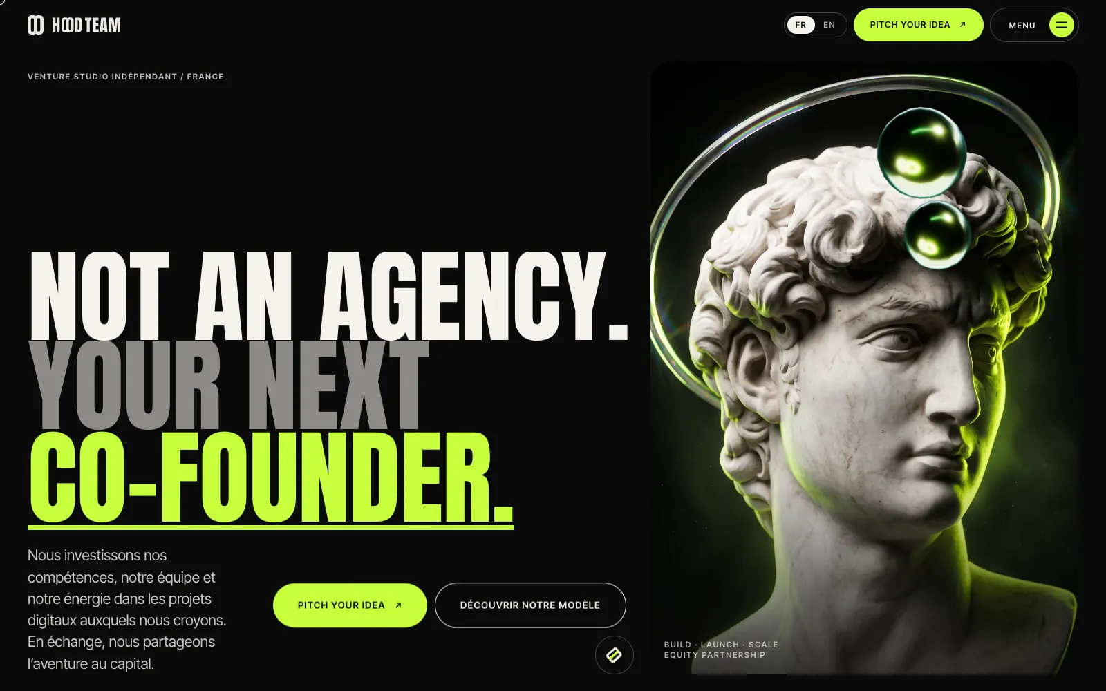
The hero fits in one line: "Not an agency. Your next co-founder." The English promise is kept in both languages, in its own column, never laid over the image. Only two actions: pitch your idea, discover the model.
Marble and lime
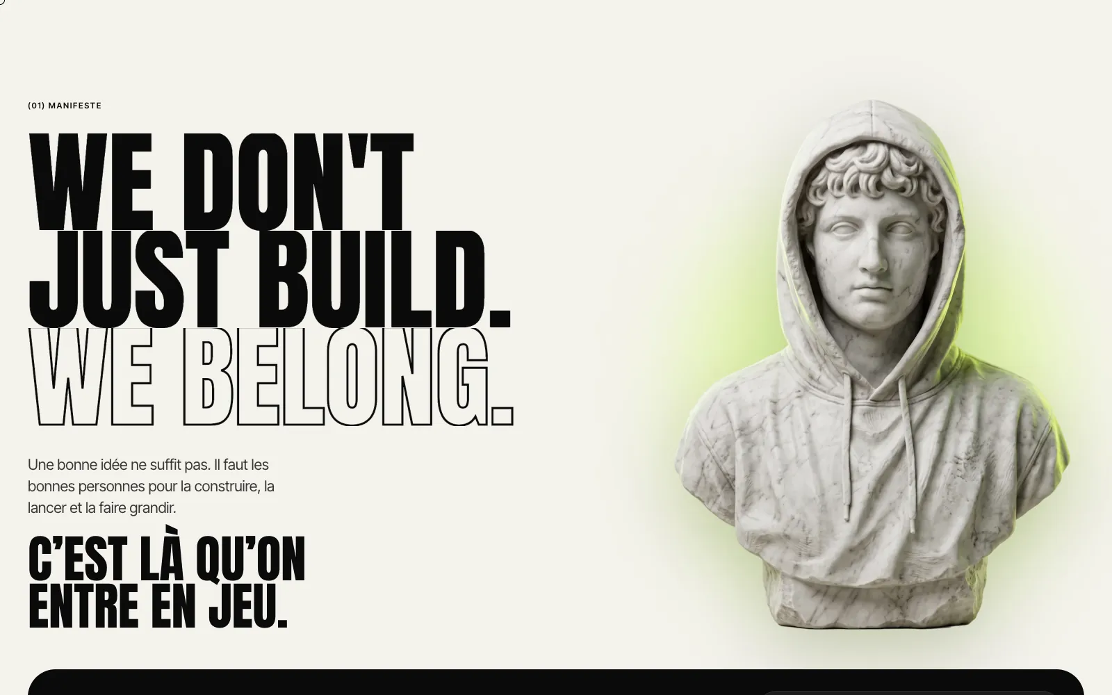
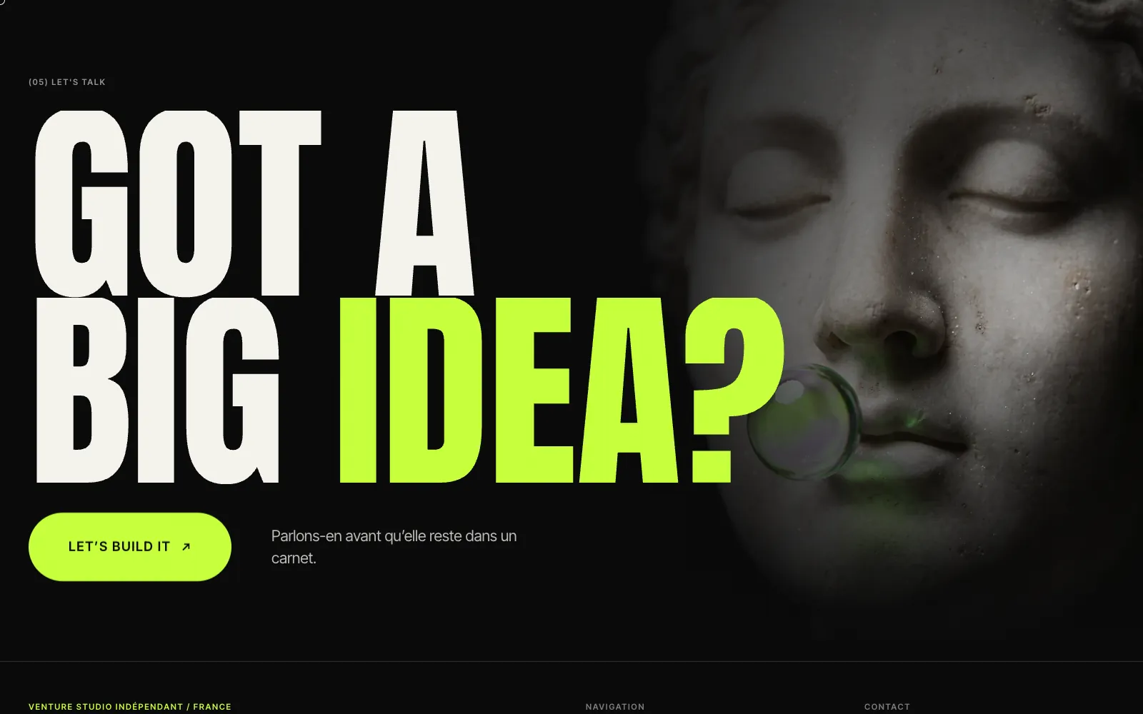
Marble busts and hands lit with acid green: the classical for solidity, the green for startup energy. Black, ivory and #C6FF3B lime, a heavy condensed display face (Anton) and Inter Tight for text. The founding duo shows in the logo: two "O"s sharing the same green stem.
Two men facing the same way
The "Your idea. Our team. Shared future." band shows two busts looking in the same direction, not at each other: an image of partnership, not negotiation.
The model explained without jargon
A dedicated page compares the agency model and the HOOD TEAM model (role, pay, commitment, horizon), with an involvement curve over time: the agency leaves at launch, HOOD TEAM stays.
Built to be found and cited
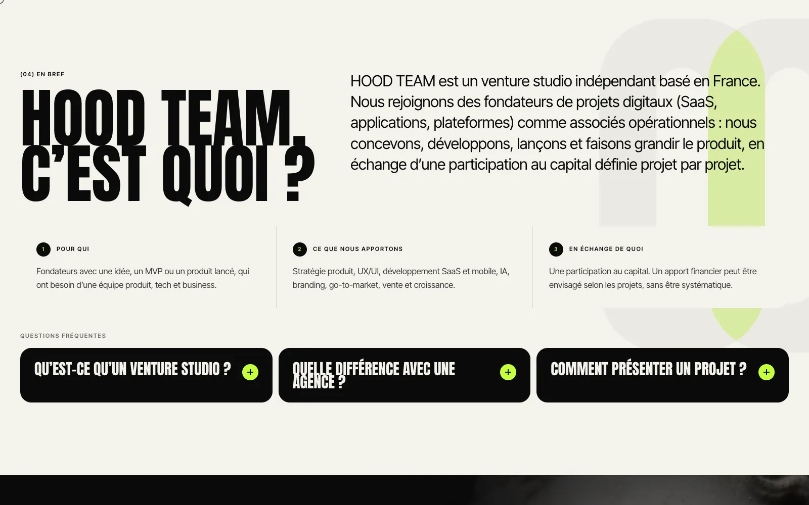
Structured data on every page, a bilingual sitemap, AI crawlers allowed, llms.txt files, an "In short" section and an FAQ on the home page: the site answers Google and AI assistants alike.
Takeaways
- To sell a partnership, tone matters as much as the offer: state it, then explain it.
- A strong, reduced art direction (two materials, three colours) carries across every page effortlessly.
- Comparing models side by side convinces faster than a long pitch.
Expertise involved: digital art direction, website design, front-end development.