The problem
In online fashion, the "M or L?" moment is expensive. It drives abandoned carts and return rates that often top 30% on apparel. Size charts are hard to read, they vary from brand to brand, and nobody knows their own measurements.
WeeFizz answers with personalized size recommendations: a few questions about body shape, a measurement engine, and a recommended size for each product, right on the product page.
My role
Co-founder and head of product. I owned the vision, end-to-end design and a large share of the front-end integration, working alongside the CEO, who leads the brand and sales. In practice:
- Designed the e-commerce widget and its variants for four CMS platforms.
- Designed the client dashboard and self-service onboarding.
- Designed and built the internal back office and the super admin area.
- Design system, i18n system, uniform program mini-sites for workwear clients.
- Art direction for all marketing: website, landing pages, campaigns, demos.
Key design decisions
Three axes instead of twelve measurements
Early versions asked for body measurements. Completion was low: nobody has a tape measure at hand. We switched to a short wearer questionnaire built on three body shape axes, plus height, weight and age. The engine does the rest. The result: a questionnaire completed in under a minute and a completion rate above 80%.
A recommendation rule you can explain
When a wearer falls between two sizes, a one third / two thirds rule decides. Rigid garments (no stretch) require the exact size. These rules are fixed, documented and explained to clients. A recommendation you can explain is a recommendation people trust.
The widget has to disappear into the store
The widget runs inside hundreds of different themes on Shopify, WooCommerce, PrestaShop and Magento. It had to look right everywhere, stay light and accessible, and never break the product page. That was as much a design job as a code job: overridable tokens, complete states, and automated visual QA before every release.
Analytics people actually trust
The analytics redesign replaced decorative charts with readable bars, a per-product view and an explicit confidence indicator. Clients started using it to adjust their size charts.
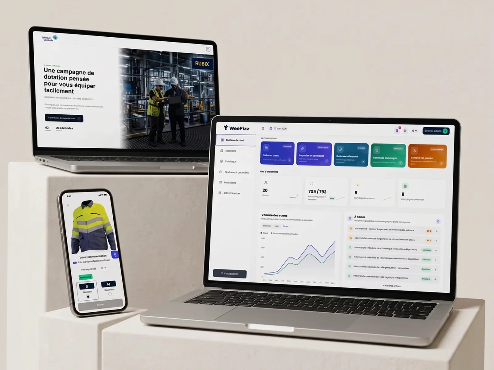
WeeFizz PRO and workwear programs
Beyond fashion, WeeFizz equips companies that provide work clothing to their employees. I designed the PRO SaaS: a five-step campaign wizard, multi-campaign sites, an allocation CRM with a Kanban board, a size reference library, automatic size chart extraction from Excel files, PDFs or images, an analytics assistant, an approver workspace and mini-sites for wearers.
Marketing and demos
Art direction for a cream and midnight blue system, locked for all marketing. Redesign of the public website, campaign landing pages, product announcement pages, Meta campaigns, and a pipeline of twelve demo sites recreating the experience of real prospects, each with its own identity.
Takeaways
- The best screen is the one you remove: three axes instead of twelve measurements.
- A SaaS sold to online stores is judged in the store, not in the dashboard.
- The design system and automated QA are what let you ship fast without regressions.
- AI belongs in the engine and in the production workflow, never as a marketing veneer.
See weefizz.com. Expertise involved: B2B SaaS UX/UI, design system, art direction, front-end.